|
I was asked to make 3 different logos or versions using the skills I learned in Gravit. The tools I used in Gravit are the pen tool, filling colors, making borders and combining shapes. I used the pen tool to create the basic shape and I used shapes for the background and I also combined the path and the shape to make another shape. Drawing with pen was really hard because it wasn't really accurate but I succeeded editing a lot of times. A.S.C is an imaginary company made when we take Andrew's air pods as a joke and hide it. 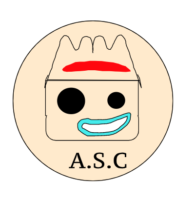 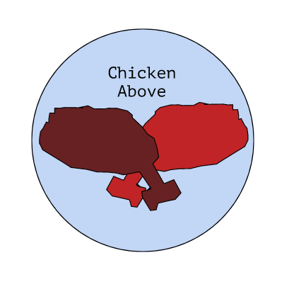 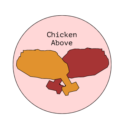 My favorite logo is the logo beneath. The name of my brand is "chicken above" because it related to my name. My brand is a fried chicken brand. The logo shows the two chicken legs to represent that it is a chicken brand. I like that logo because it represents the Korean style chicken with the two basic and common flavors. I also like it because the background really contrasts well with the chickens and it looks well. 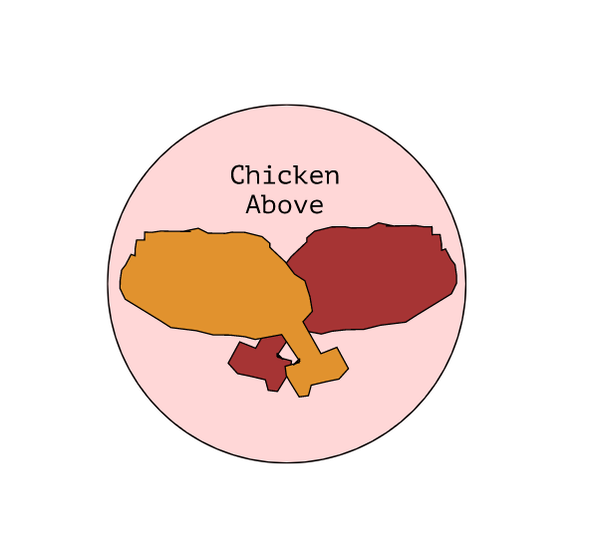
0 Comments
In this unit, I was asked to do two tasks: Color names and Color schemes. For the "color names" task, I needed to create a work that displays more than 15 different colors, and I had to label it in the RGB values and the hex code. In this task, I had success in displaying colors inside a star, aligning from sort of a brighter color to darker colors. For the "color schemes" task, I needed to present the 4 color schemes, monochromatic, analogous, complementary and triadic, in any way I wanted. I used adobe color to create the pallets and I pasted the hex code of the made pallet to fill in my t-shirts I traced in Gravit. I successfully traced out a t-shirt and filled it with the pallet colors I created. Color Names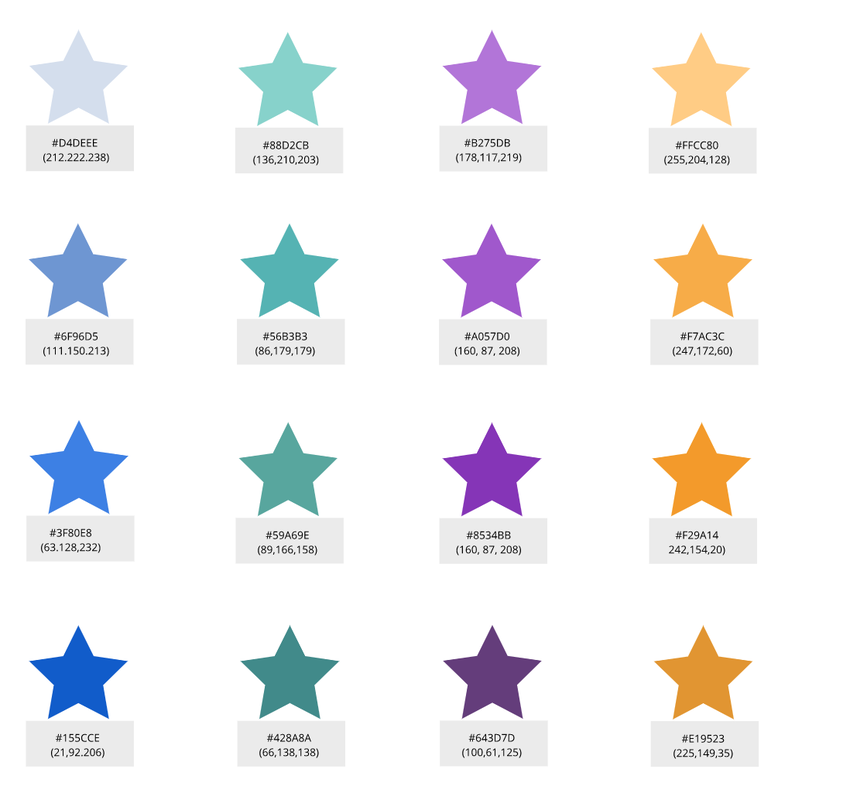 Color Schemes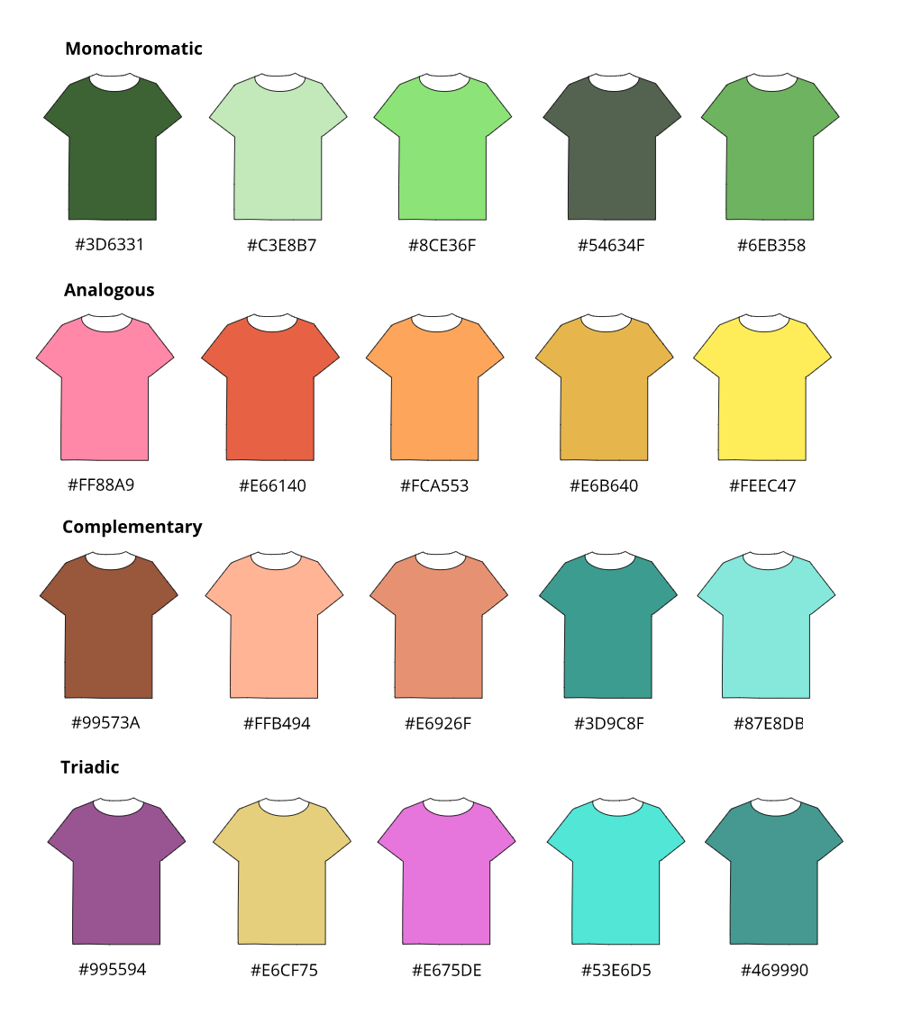 Typography is the visual component of the written word. It is important because it gives the first impression of something. If it is a book, the customer will most likely buy a book that looks good and interesting. Typography is important because of that. The quote "each font has a personality and purpose" means that every font goes well with different words and different situations. The five type of fonts we learned in class was serif, sans serif, mono spaced, hand written and display. Serif fonts have the small feet but sans serif fonts don't. Monospaced fonts have the same space in between each letter. Handwritten fonts are handwritten/cursive style. Lastly, display fonts are unique fonts that stick out. Serif fonts are mostly used in writing, sans serif fonts are the most commonly used. Monospaced fonts are usually used for type writers and for computter programming. Handwritten fonts are also used for writing and display fonts can be used for a signboard. Type face comparisonFor this activity, I wrote a word 5 times showing the differences of the 5 main fonts I mentioned above. 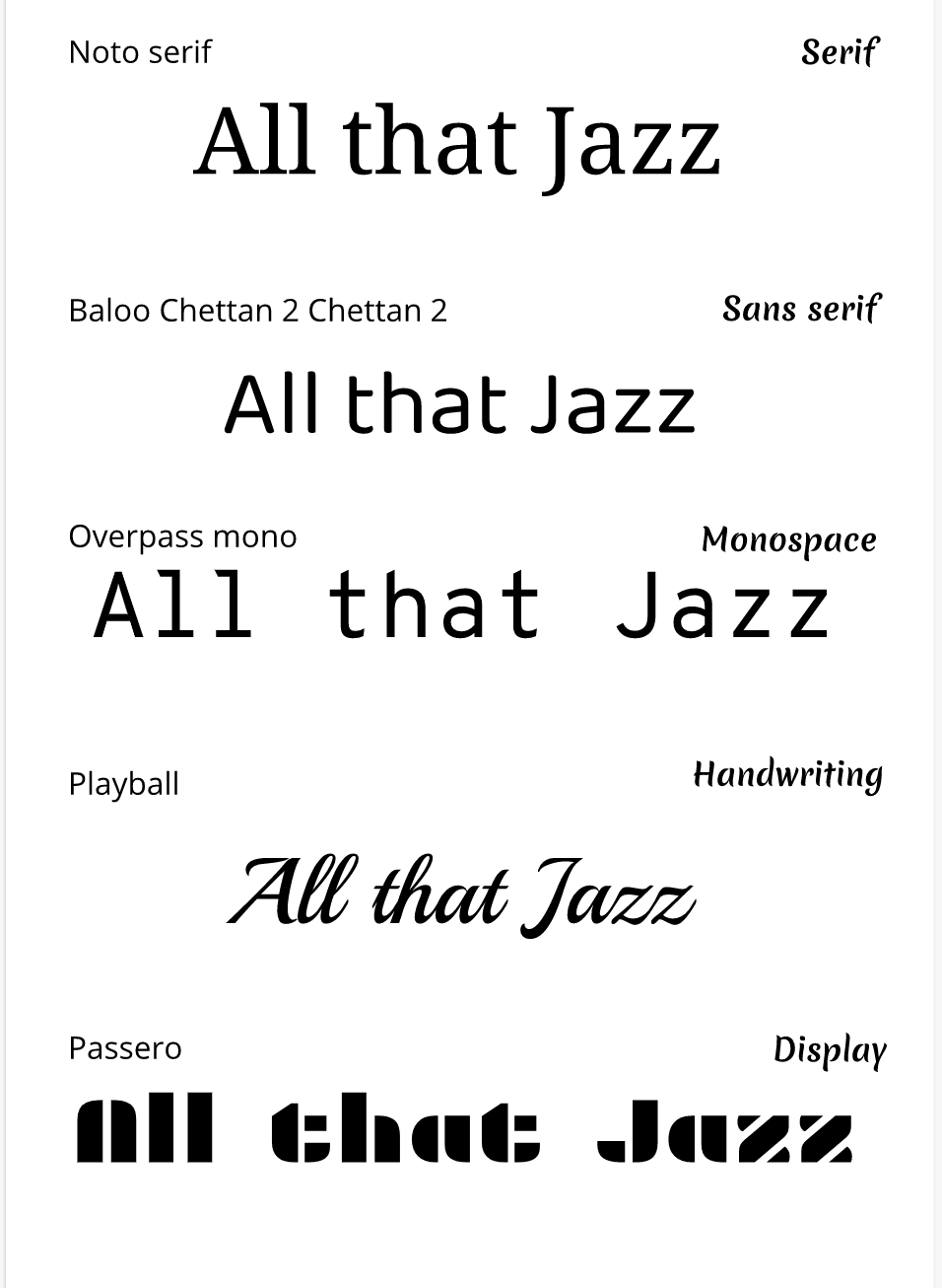 Word portraitsIn this activity, I chose 10 fonts and I had to write 1 word that matches the style of the font and 1 word that doesn't match the style of the font with the font I chose. 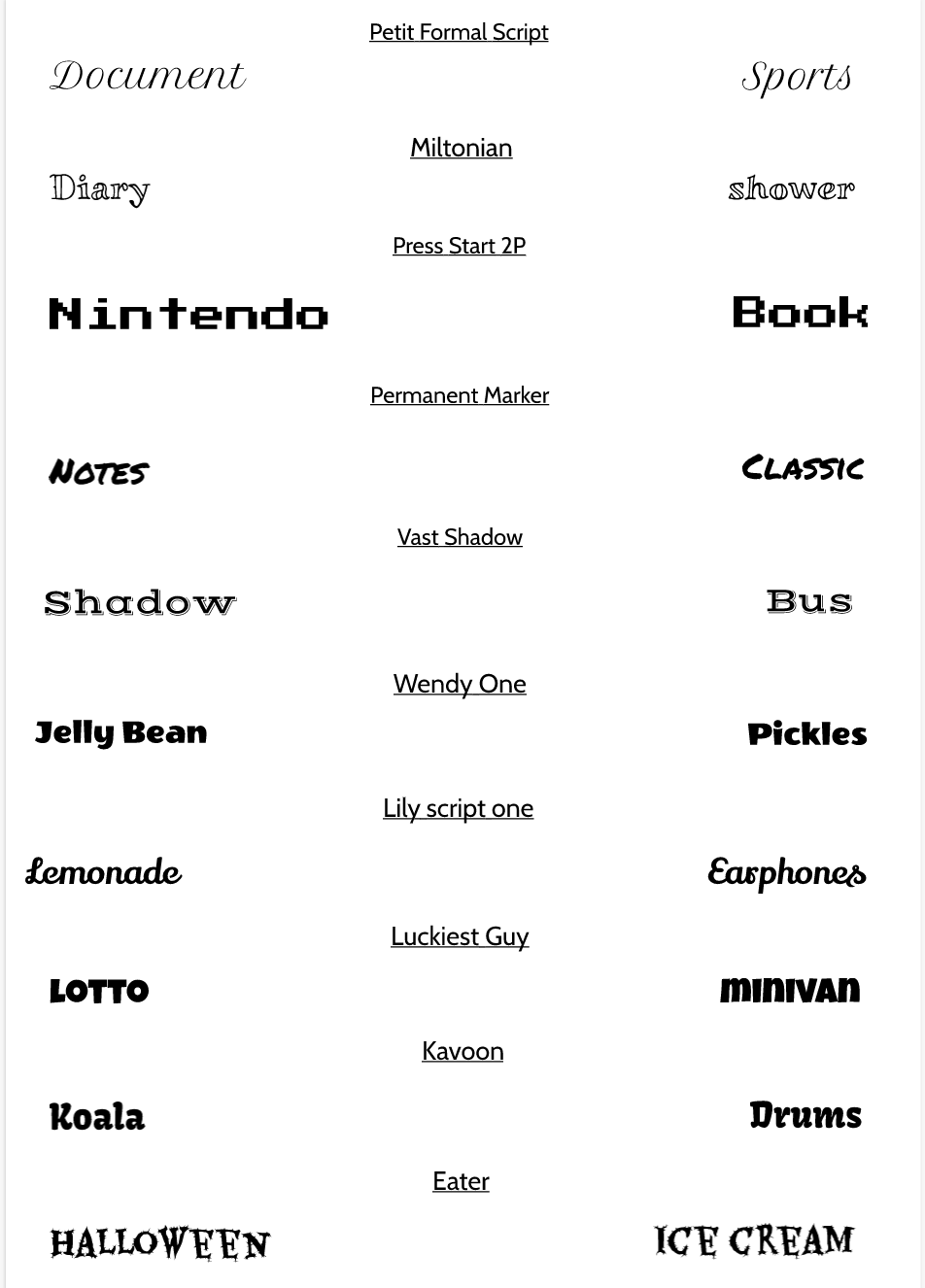 During this unit, I was assigned to use the pen tool to cutout images and make shapes. Pen tool is a very useful that we can use. With the pen tool we are able to cut out images, make clips, make shades, trace out shapes accurately. In this assignment, I was assigned to blend multiple images together using the pen tool to make a scene. I used a shocked basketball player image and a stock image because today, stocks are very popular around the world and it is one of the big issues. Some of the problems I had working on this was trying to cut the pictures perfectly and finding a background image like the monitor image to fit the player in a good angle. This is the picture of the basketball player shocked. This is the link for the picture of the stock and this is the link for the monitor image. Also, I worked on other assignments such as super heroes, spider man, and penny. 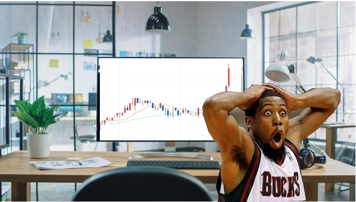 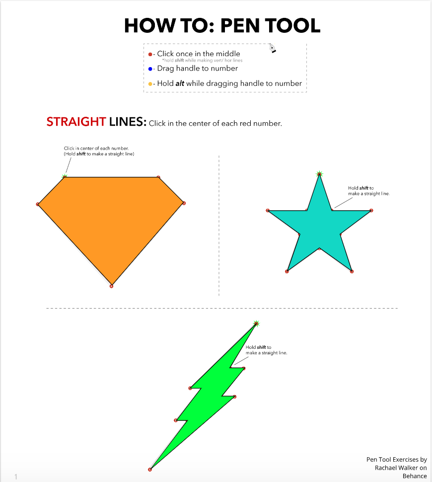 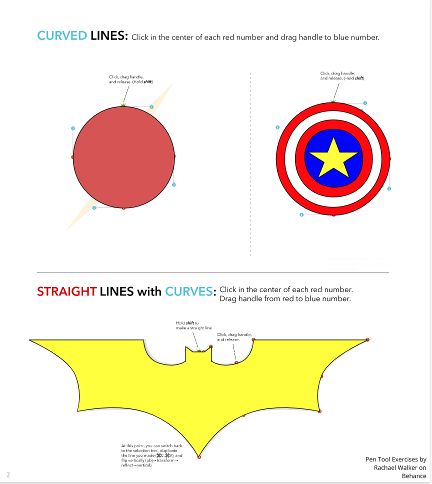 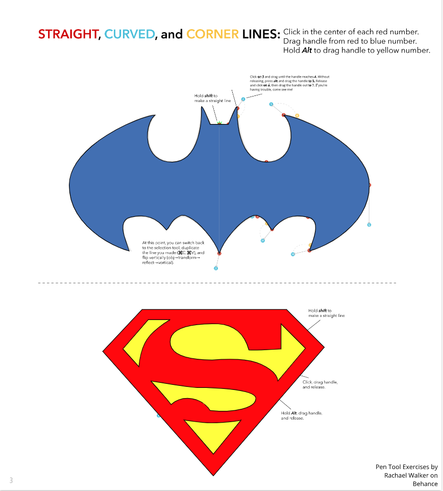 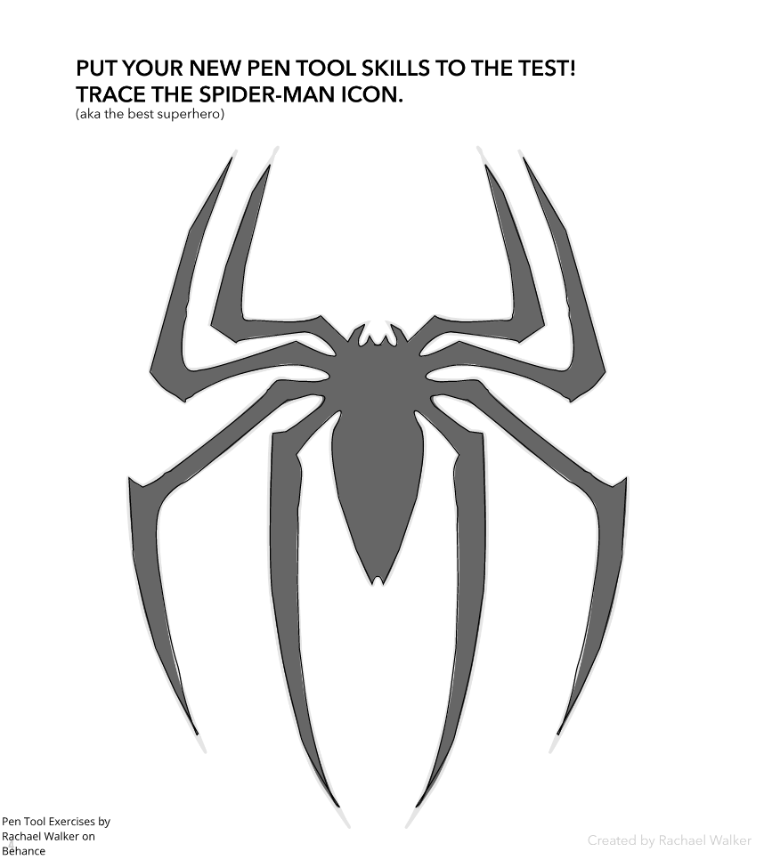 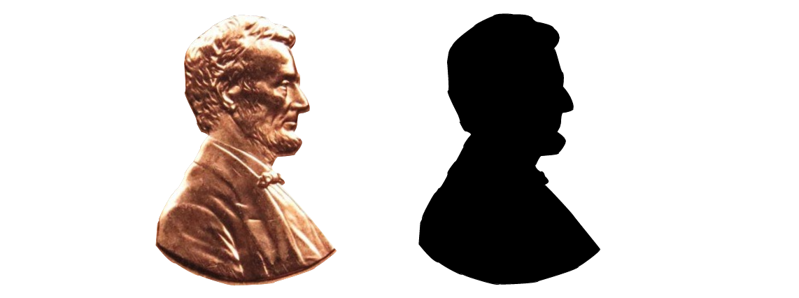 This scene is really meaningful to me. Basketball is my favorite sport and basketball gym is the place where I spend playing basketball. I made a scene of a thing I really love and like. It was hard to make this scene. Especially because we couldn't use texts. However, I was able to make it with the basic shapes. 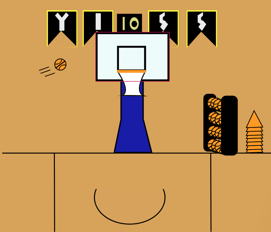 In this lesson, I learned how to make compound shapes subtract, intersect, difference shapes.  In this Lesson, I learned how to make groups, align the groups, and make layers also. 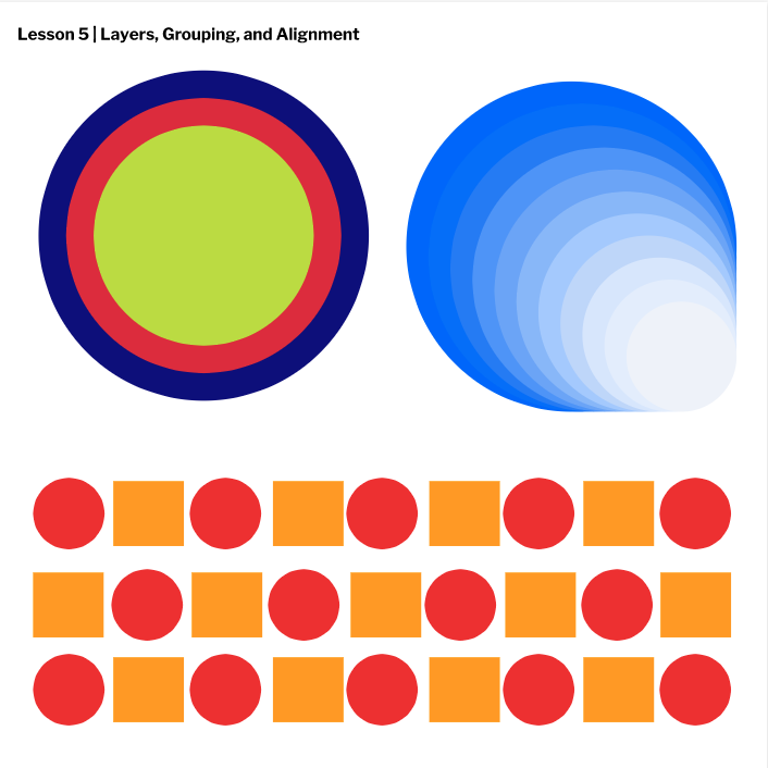 In this lesson, I learned how to control the borders, and the fill of a shape. I learned how to control the transparency and how to align the borders. 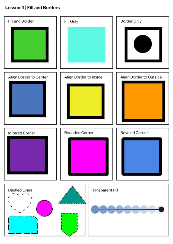 In this lesson, I learned the shortcut of each element, tools, and the use of the pointer and the sub pointer. 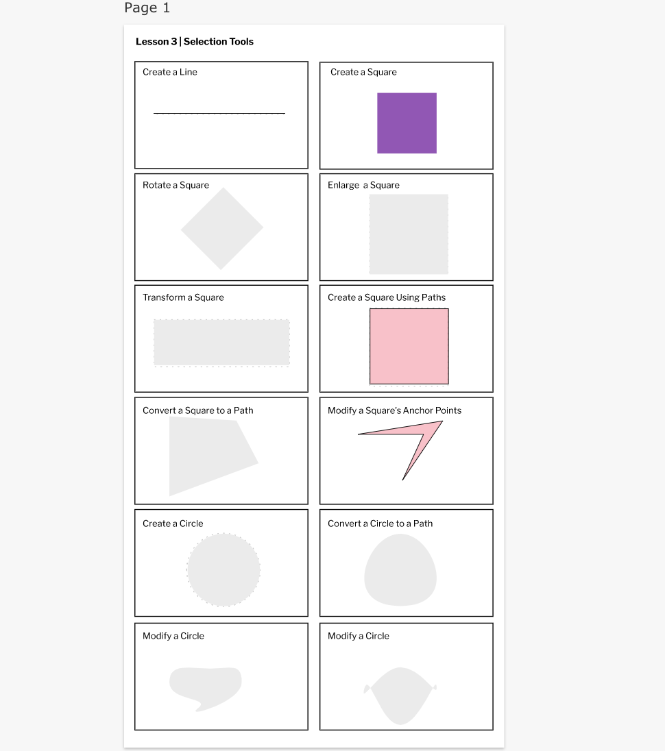 I learned the basics of gravit. I learned how to auto save, create a text element, change the fonts, change the size of the text, how to align and how to change the units.  |
|

