|
I was asked to make 3 different logos or versions using the skills I learned in Gravit. The tools I used in Gravit are the pen tool, filling colors, making borders and combining shapes. I used the pen tool to create the basic shape and I used shapes for the background and I also combined the path and the shape to make another shape. Drawing with pen was really hard because it wasn't really accurate but I succeeded editing a lot of times. A.S.C is an imaginary company made when we take Andrew's air pods as a joke and hide it. 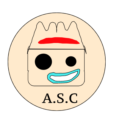 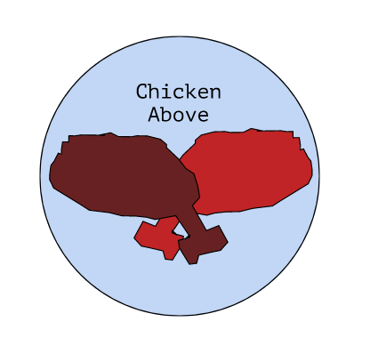 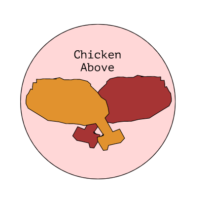 My favorite logo is the logo beneath. The name of my brand is "chicken above" because it related to my name. My brand is a fried chicken brand. The logo shows the two chicken legs to represent that it is a chicken brand. I like that logo because it represents the Korean style chicken with the two basic and common flavors. I also like it because the background really contrasts well with the chickens and it looks well. 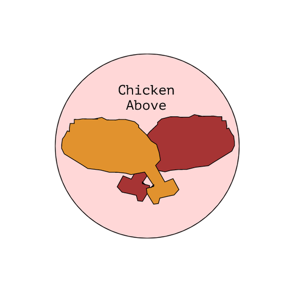
0 Comments
In this unit, I was asked to do two tasks: Color names and Color schemes. For the "color names" task, I needed to create a work that displays more than 15 different colors, and I had to label it in the RGB values and the hex code. In this task, I had success in displaying colors inside a star, aligning from sort of a brighter color to darker colors. For the "color schemes" task, I needed to present the 4 color schemes, monochromatic, analogous, complementary and triadic, in any way I wanted. I used adobe color to create the pallets and I pasted the hex code of the made pallet to fill in my t-shirts I traced in Gravit. I successfully traced out a t-shirt and filled it with the pallet colors I created. Color Names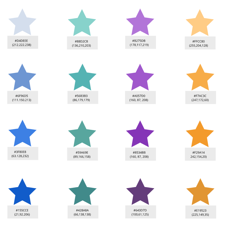 Color Schemes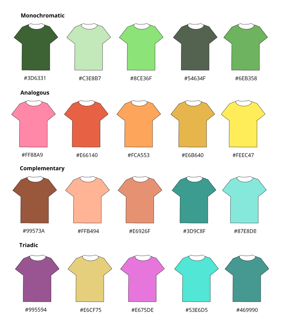 |
|

